So, let’s jump into the first secret, Your Premium Brand “How to Position Your Editorial Site as a Premium Brand to Get Interviewers who crave to be a part of your online magazine!”

There’s a great quote by Steve Forbes, the Editor in Chief of Forbes Magazine, “Your brand is the single most important investment you can make in your business”. It is just not a one time investment, you got to make a decision what you want to consistently do for your brand and keep that activity throughout the life of the brand.
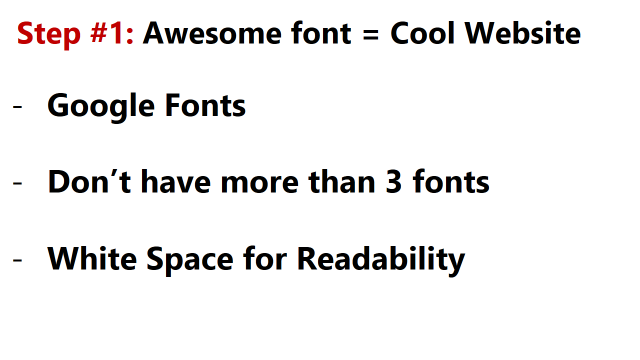
Here is the first step, have awesome font. Websites with good font look really cool. You will be able to research latest font faces in ‘fonts. google.com’ Google fonts are free, light weight and can load faster than any other fonts. Second, have maximum of three fonts, otherwise your website my look very cluttered. Your top choice has to go to the logo or site title. The second goes to the headings and the third for the text. Have a plenty of white space as it increases readability.
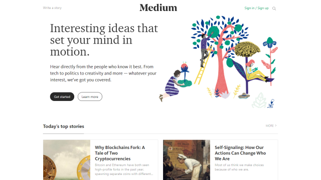
Let’s take Medium as an example, Medium is one of the top online publishing platform where people publish blogs. Medium also has used one font for site title, another for headings and third for texts. You would see a lot of white space for readability. Space between lines i.e. the line space is made equal to the height of the line itself for a clean look.
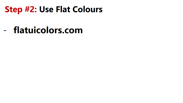
The Step 2 is use only flat color. These are latest web colors which will make your website look trendy.
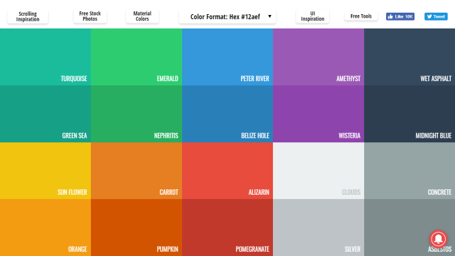
FlatUIColor.com has handpicked option of flat color, that way you will be able to decide on your brand color quick.
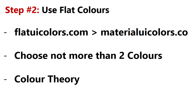
Materialuicolors.co on the other hand has all the Google flat colors. Google has spent hundreds of thousands of dollars to research on flat colors. If you are picky, then use the larger collection of Materialuicolors.co. Do not have more than two colors in the website. One color can go to the site title and headings. Second can go the call to action buttons. Use dark greys for text.
Different colors evokes different emotions. By using the right color you will be able build a connection with your readers quickly.
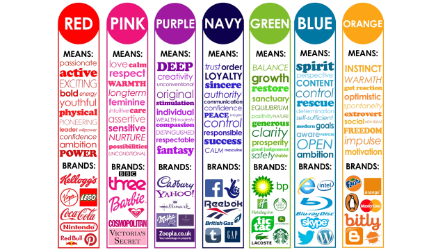
Red means passionate, sexy and bold. Pink symbolizes care, feminine and love. Purple create inquisitiveness, also a symbol for creativity. Navy offers loyalty, authority and control. No wonder most of the banks use navy. Green is for organic, growth and balance. Blue conveys openness and free spirited. Orange is for warmth and action.
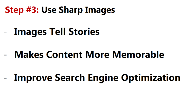
Step 3 is use sharp high definition images. Images tell stories, another great way to create bonding with your readers. Good Images also make the content memorable. As you may see, I have added relevant images to bring in a particular mood whenever needed in this webinar. Third, Images improves SEO.
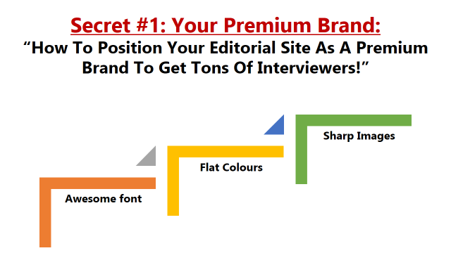
So, here’s are the steps you need to follow:
First, Identify great fonts, then choose colors to suit your community and last have sharp images to tell a great story to your reader. Building brand is all about tell great stories to your clients.
